After-Sales Flow
Redesign
Rebuilding the after-sales path for JD Express — turning a fractured e-commerce
process into an emotion-aware repair flow built for instant delivery.
PROJECT META
01
UX Designer
End-to-end flow redesign
02
Instant Retail
京东秒送 · Food Delivery
03
Benchmark
Meituan after-sales structure
04
Outcome
Shorter submission · lower re-contact
BACKGROUND · 01
After-sales for food delivery
is a different problem.
JD Express inherited its after-sales flow from JD's traditional e-commerce. But instant retail food delivery is
fundamentally different — meals can't be returned, fulfillment windows are minutes long, responsibility is split
across merchant, courier, and platform, and users almost always arrive in a heightened emotional state.
01 · REVERSIBILITY
Can it be returned?
TRADITIONAL
Returnable goods — refunds tied to physical return.
INSTANT RETAIL
Irreversible meals — value can't be physically returned.
02 · FULFILLMENT WINDOW
How long is the loop?
TRADITIONAL
Days to weeks — users tolerate longer review.
INSTANT RETAIL
Minutes — every extra tap drains patience fast.
03 · RESPONSIBILITY CHAIN
Who is accountable?
TRADITIONAL
Clear, single-party — one seller, one fulfillment center.
INSTANT RETAIL
Split across merchant, courier, and platform.
04 · USER STATE
How does the user arrive?
TRADITIONAL
Rational evaluation — comparing, planning, returning.
INSTANT RETAIL
Emotional and time-pressured — wants fast resolution.
Problem Diagnosis · 02
A flow built for the wrong scenario.
Auditing the original flow surfaced three structural mismatches between the e-commerce template and the realities of instant delivery.
01
Platform-centric labels
Reasons read like a backend taxonomy.
Categories were split by internal accountability, but real users describe problems situationally: missing items, wrong order, cold food, slow delivery.
02
Overly deep paths
Too many taps for a 30-second window.
Picking a category, then a subcategory, then writing an explanation amplified impatience precisely when users had the least patience to give.
03
Wrong semantics
Return logic that did not fit food.
The page kept return-goods language even though meals cannot physically be returned, weakening the flow's credibility.
Insight
After-sales had become the experience's most visible fracture point.
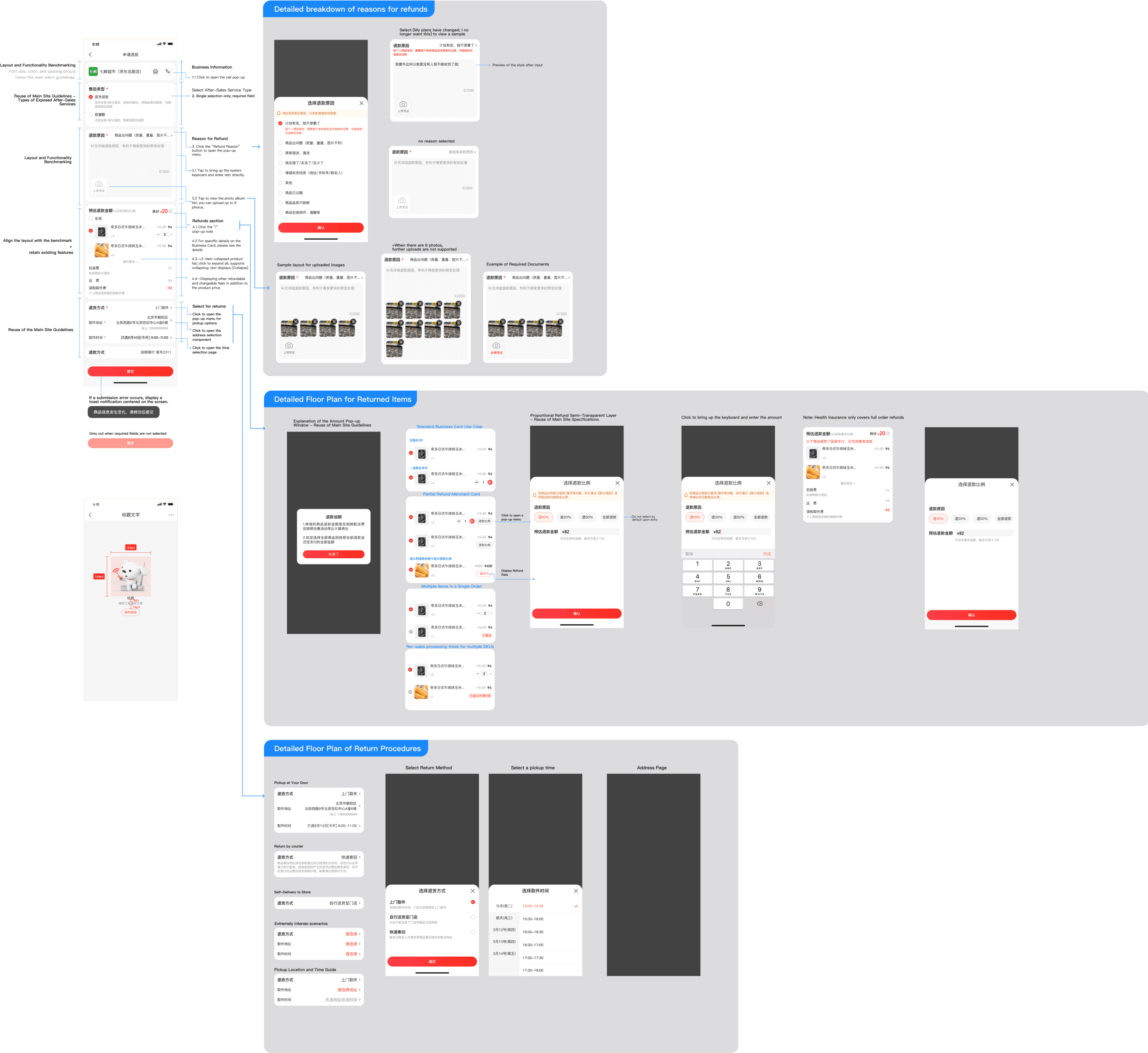
DESIGN MAPPING · 05 · BUSINESS NEEDS → STRATEGIES
From business needs to design strategies— a complete mapping.
Three business asks and five user-side problems form the left-side input, converge into three core design goals, and expand into nine concrete, shippable design strategies.
BUSINESS NEEDS
Shorten after-sales submission time
Reduce user re-contact rate
Strengthen platform trust
USER PROBLEMS
Categories built around platform
accountability
Submission path too deep
'Return' semantics misfit for food
delivery
Responsibility split exposed to users
Flow doesn't absorb emotional state
DESIGN GOALS
GOAL 01
Match the user's
mental model
GOAL 02
Compress interaction
cost
GOAL 03
Push complexity back
to the system
DESIGN STRATEGIES
01
Reframe labels in user language
02
Front-load high-frequency reasons
03
Compress path from 5 to 2 screens
04
Auto-suggested descriptions
05
Remove 'return' semantics
06
Silent backend responsibility routing
07
Emotion-first feedback tone
08
Clear next-step expectations
09
Backend absorbs the complexity
PILLAR 01 · LABEL REBUILD
User Language
From backend taxonomy
to user-perceived expression.
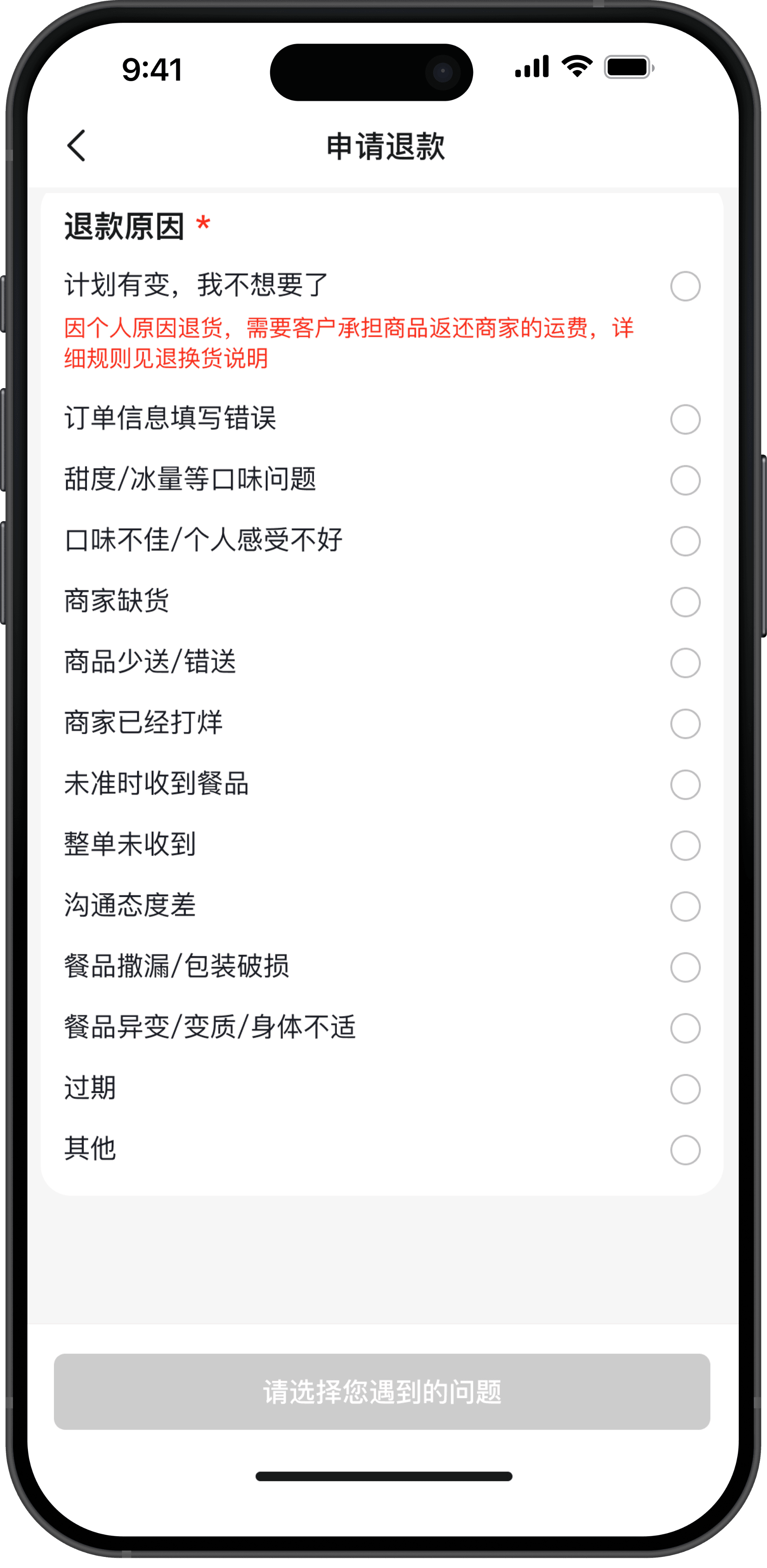
Reason categories were reframed around the situation a user is actually in — not
who is internally responsible. Top-level options speak the user's words directly, so
the right category is visible on the first screen.
BEFORE · PLATFORM TAXONOMY
Product Issue
Logistics Issue
Other
AFTER · USER LANGUAGE
Missing or wrong items
Food quality problem
Delivery problem
Order not received
REDESIGN PILLARS · 04
Three dimensions,
one coherent flow.
The redesign moved on three coordinated
dimensions: reason labels reframed in the
user's language, the interaction depth
compressed to fit a 30-second emotional
window, and a delivery-native logic that
takes the complexity off the user and
pushes it back to the system.
PILLAR 03 · DELIVERY-NATIVE LOGIC
Stop saying 'return'. Move complexity off the
user.
Backend Routing
Returns don't exist in food delivery — meals are irreversible. We removed e-commerce semantics, replaced them with 'issue
resolution' language, and moved responsibility judgment (merchant / courier / platform) into the backend so users never have to
model the platform's internal structure.
01 · SEMANTIC SHIFT
Issue resolution, not
returns.
Every label and CTA was rewritten so
the page sounds like it understands
delivery — not like a returns counter.
02 · SILENT ROUTING
Responsibility decided
server-side.
The system identifies whether
merchant, courier, or platform is
accountable. Users describe their
situation, not the org chart.
03 · EMOTION-FIRST UX
Built for the heightened
state.
Calmer tone, faster confirmation, and
clear expectation setting on what
happens next — so the flow feels like
care, not bureaucracy.
— DESIGN PRINCIPLE
"The system absorbs the complexity.
The user only describes the situation."
PILLAR 02 · INTERACTION DEPTH
Compress the path. Front-load the frequent.
30s Target
Fewer detours, fewer cross-screen jumps. The highest-frequency reasons surface first, descriptions auto-suggest, and
submission can complete inside the 30-second window that food delivery users actually have.
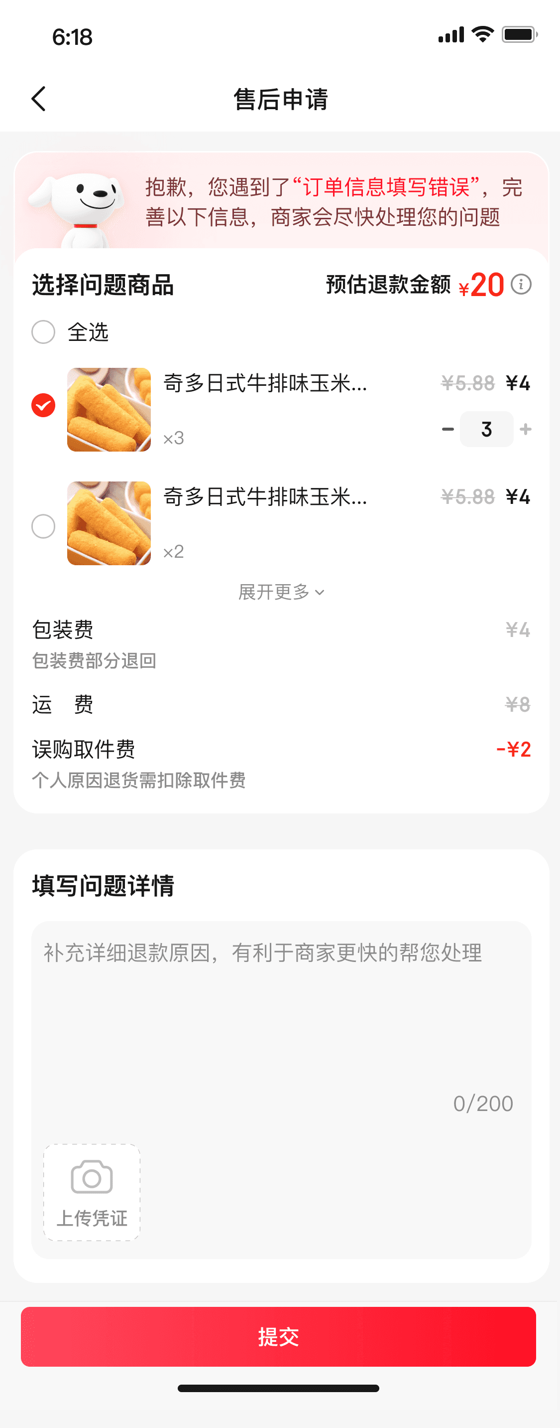
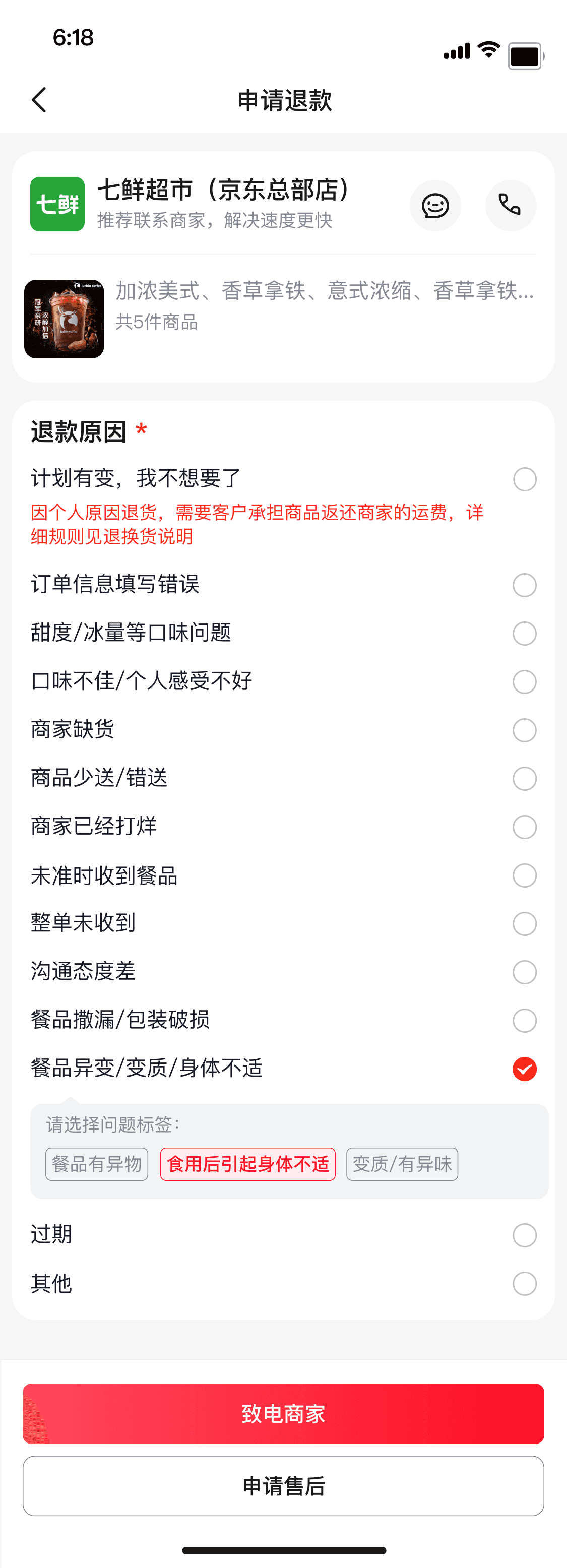
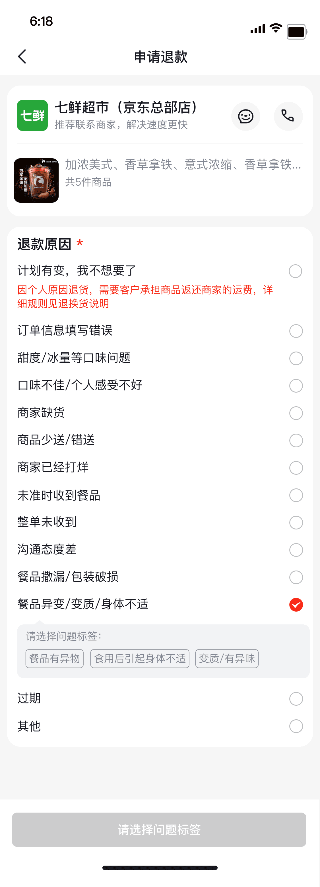
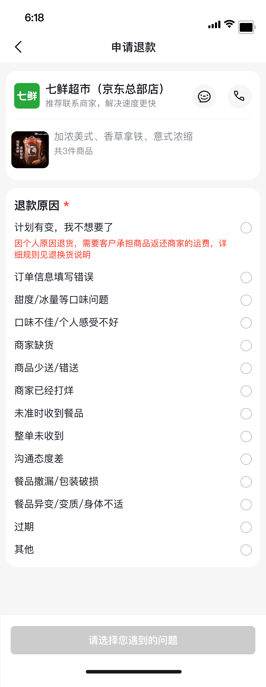
PATH DEPTH
Before · 5 screens
→
After · 2 screens
01
Open
Tap 'Get Help' from order
detail.
→
02
Pick
Choose a user-language
reason on the first
screen.
→
03
Add Detail
Optional context with
auto-suggested phrases.
→
04
Submit
System routes
responsibility silently in
the background.
IMPACT · 05 · POST-LAUNCH REVIEW
Shorter path,
calmer users.
After launch, we tracked three metrics that
matter most for an emotion-sensitive flow:
how often it was completed, how long
submission took, and how often users had to
come back and ask again. All three moved in
the right direction.
METRIC 01 · TIME
−42%
Faster
submission
Compressing the path from five screens
to two pushed average submission time
inside the 30-second target window
users actually have.
METRIC 02 · RE-CONTACT
−31%
Fewer follow-
ups
With clearer structure and user-language
labels, users understood the flow on the
first pass — and didn't need to re-open
conversations or chat agents.
METRIC 03 · COMPLETION
+18%
More users
finish.
A flow that mirrors the user's mental
model and respects their emotional state
turns abandonment into resolution —
fewer drop-offs mid-flow.
After-sales Process - Primary Reasons - Secondary Reasons
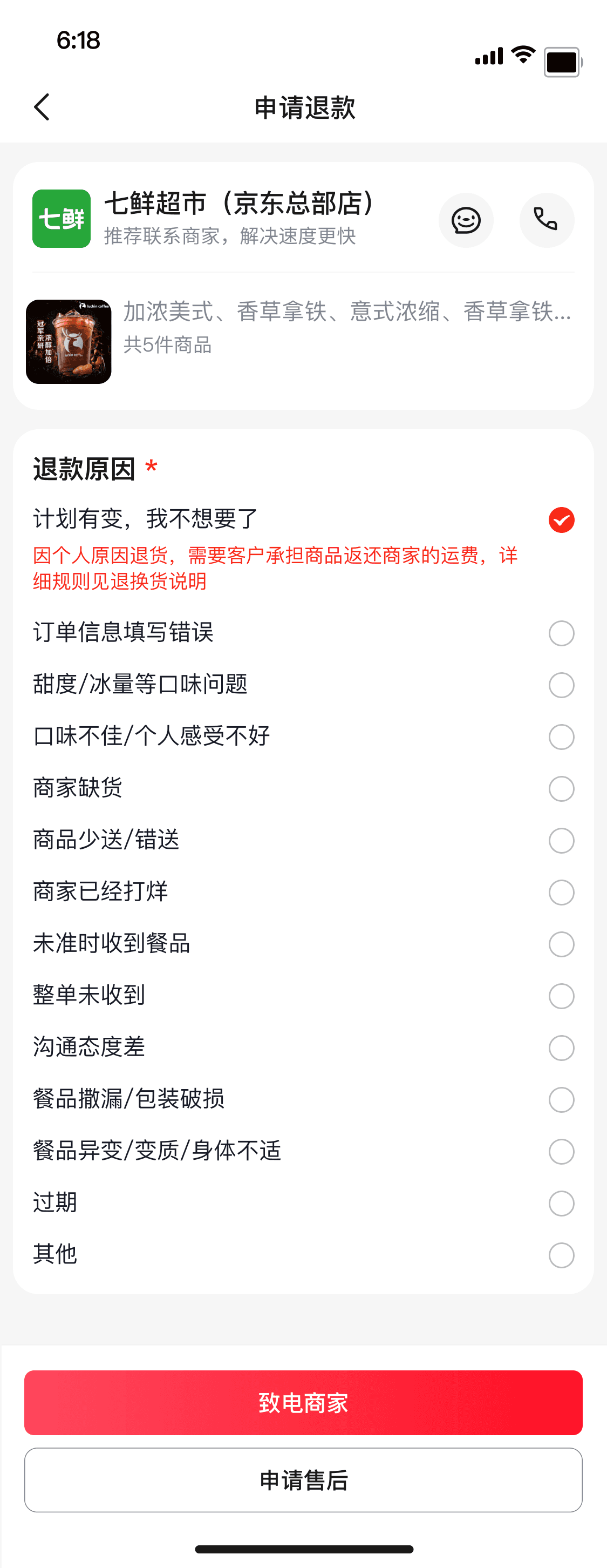
After-sales Process - Primary Reasons
WHAT THE NUMBERS REALLY SAID
05.A
A shorter path didn't just save seconds — it absorbed the emotion
users brought in.
The metric that surprised us most was the drop in re-contact rate. It told us users weren't just finishing faster — they were finishing once.
That's the real signal: the flow now meets the user's mental model on the first pass, so doubt and frustration don't compound into
another conversation.
REFLECTION · 06 · AFTER-SALES AS TRUST INFRASTRUCTURE
After-sales is the
foundation of trust.
INNER NOTE
06.A
This rewrite changed how I think about after-sales. It isn't a remediation mechanism bolted
onto a happy path — it's part of the trust infrastructure of the platform itself.
In instant retail, trust is rarely built when an order goes smoothly. It is built — or destroyed — in the
moments after something goes wrong. A bad after-sales experience is one of the strongest
predictors that a user won't come back.
And users entering the after-sales flow are almost never calm. They're hungry, late, frustrated, or
upset. The flow is not a rational decision tree — it's an emotional repair process. Treating it as
anything else is a category error.
A NEW DEFINITION · 06.B
After-sales is not a safety net.
It is the structure that holds trust together when
everything else fails.
It decides whether users stay on the platform — and whether the platform actually understands the situation users are in. That's the real
surface area of trust, and it's the surface area worth designing for.
01
Emotional Repair
After-sales flows are not rational
decisions — they are repair processes
for users in heightened emotional states.
02
Scenario Native
A flow designed for the actual scenario
beats a generic template adapted from a
neighboring business unit, every time.
03
Trust Infrastructure
After-sales is not a remediation layer — it
is the structural mechanism through
which platform trust is built or lost.