CASE STUDY
JD EXPRESS · 京东秒送
03
Store Page
Design
Redesigning the store page to reduce cognitive load in instant retail — where users
make purchase decisions within 30 seconds.
Redesigning the store page to reduce cognitive load in instant retail — where users
make purchase decisions within 30 seconds.
Redesigning
Read Deck
中文
01
UX Designer
Store page system redesign
02
Instant Retail
JD Express · 京东秒送
03
Decision Research
30-second user window
04
3 Store Types
Food Delivery · Supermarket · Brand
BACKGROUND · 01
The store page is a decision
battlefield.
Many assume the store page is just a product list. In instant
retail, it is the moment where purchase decisions happen.
Users arrive with a problem — hunger, a forgotten item, an
emergency — and must decide within 30 seconds.
Data confirmed this: large volumes of bounce behavior
were occurring right inside the store page — not at the
search or category level, but at the moment of evaluation.
● KEY QUESTION
What role does the store page actually
play?
The store page is not a display surface — it is a
decision interface operating under extreme time pressure.
01 · FINDING
High Bounce Rate
Significant drop-off was happening inside the store page itself — users
were landing, evaluating, and leaving without converting.
02 · FINDING
30-Second Window
Users were completing — or abandoning — purchase decisions within 30
seconds of entering a store page.
03
Multi-tab Confusion
Users opened multiple store tabs to compare
— a signal the page wasn't providing enough
decision support.
04
Structural Mismatch
The page structure treated all store types
identically — mismatching the mental models
of very different user intentions.
05
Decision Without Resources
Critical decision inputs — delivery time, price
comparison, trust signals — were buried or
absent.
SYSTEM ANALYSIS · 02
Every visit is a decision
under pressure.
Users simultaneously resolve competing questions within 30 seconds — price, discounts, delivery time,
and trust. These are not sequential; they fire all at once.
How long is delivery?
Are there discounts?
Is this store
trustworthy?
More expensive than the
next?
Is it cheaper than other platforms?
How much can I actually save with this discount?
Are there any negative reviews?
Is it an official brand?
Users aren't browsing
→
They're making rapid purchase decisions
PROBLEM DISCOVERY · 03
Different decision-making logics
for different scenarios.
Three store types live inside JD Express — food delivery,
supermarket, and brand store. Each one carries a
fundamentally different purchase motivation, yet the
original page applied one unified information structure to all
three.
● CORE TENSION
Same structure.
Three different minds.
Each scenario demands a different information
architecture — yet all three lived inside the same
template.
FOOD DELIVERY
Quick Decision
Delivery Time
Best Sellers
Immediate satisfaction
FOOD DELIVERY
Value for Money
Single Item Price
Discounts
Bundle Discount
FOOD DELIVERY

Trust-Based Decision
Brand Identity
Quality Awareness
Overall Sense
USER PERSONAS · WHO USES WHAT
Three users. Three motivations.
Can our existing design serve three fundamentally different use scenarios?
01 · FOOD DELIVERY USER
Young People


Orders lunch from office, time-sensitive
Needs: speed clarity, delivery time,
popular dishes surfaced immediately
02 · FRESH MARKET USER
Middle-aged and older adults


Compares across multiple stores, price-
sensitive
Needs: price comparison, discount rules,
freshness indicators
03 · BRAND STORE USER
Quality-Seeking Parent


Shops for family, quality and authenticity
first
Needs: brand trust, product specs,
certifications, honest reviews
DESIGN CHALLENGE
How can we make the
design
afford the three different
users?
The core structural problem: a single page template that does not adapt to
fundamentally different decision-making models.
BEFORE INFORMATION STRUCTURE · 03.B
One structure, three decision models —
an inherent mismatch.
Before information structure
Using the same structure to support three
different decision-making models is inherently
illogical.
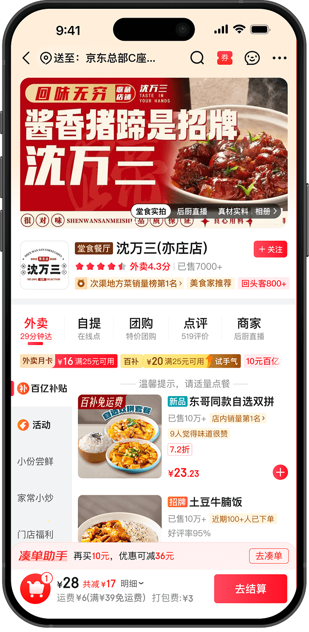
The original store page treated all three scenarios identically — top
navigation, store overview, category tabs, promotions, products,
checkout. Every user got the same layout regardless of what they
actually came to do.
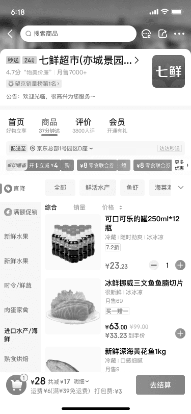
Top Navigation Area
Store Overview
Category Tabs
Promotions Layer
Product Listing Cards
Checkout Bar
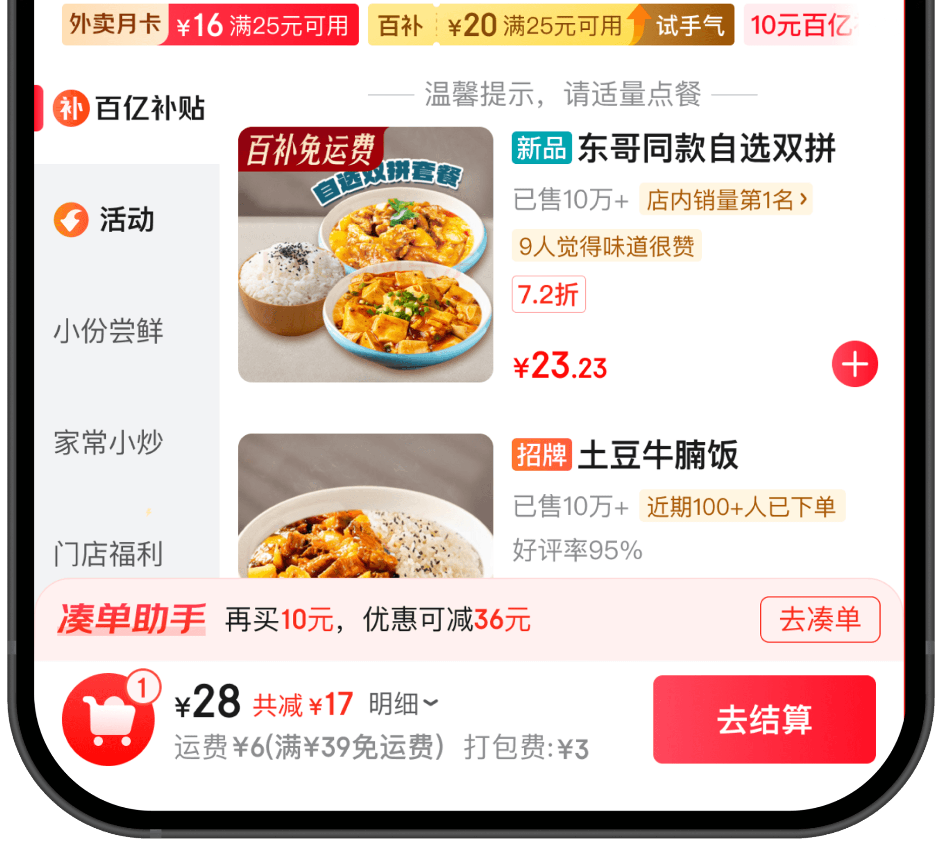
A look at the first scenario — the JD Instant Delivery food category. Each redesign decision targets a
specific cognitive friction point in the user's 30-second decision window.
DESIGN SOLUTION · 04
The design objective is to
reduce decision-making costs.
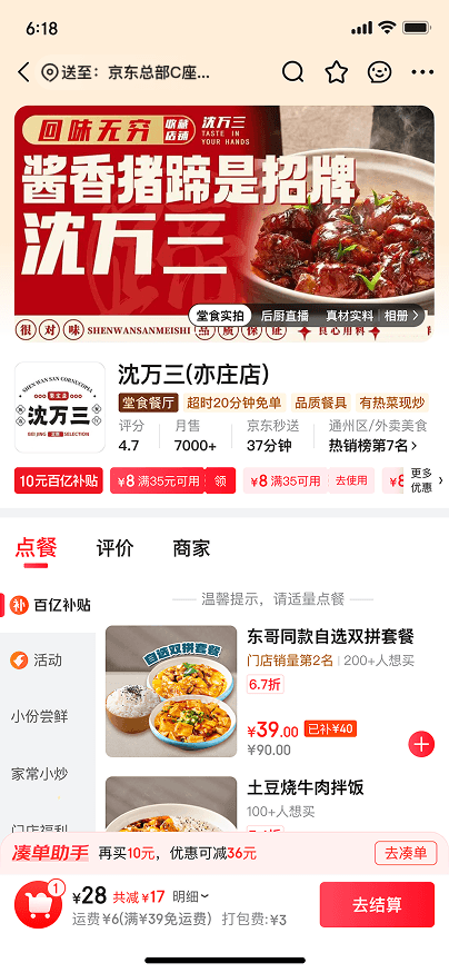
01 · FOOD DELIVERY SCENARIO
BEFORE
AFTER
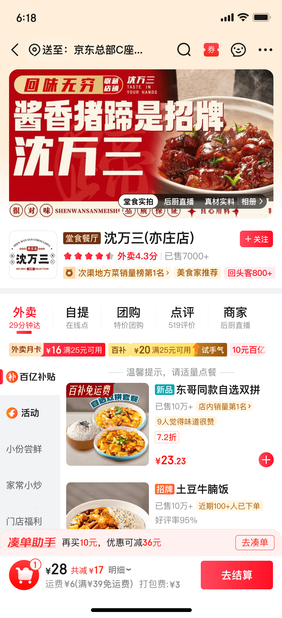
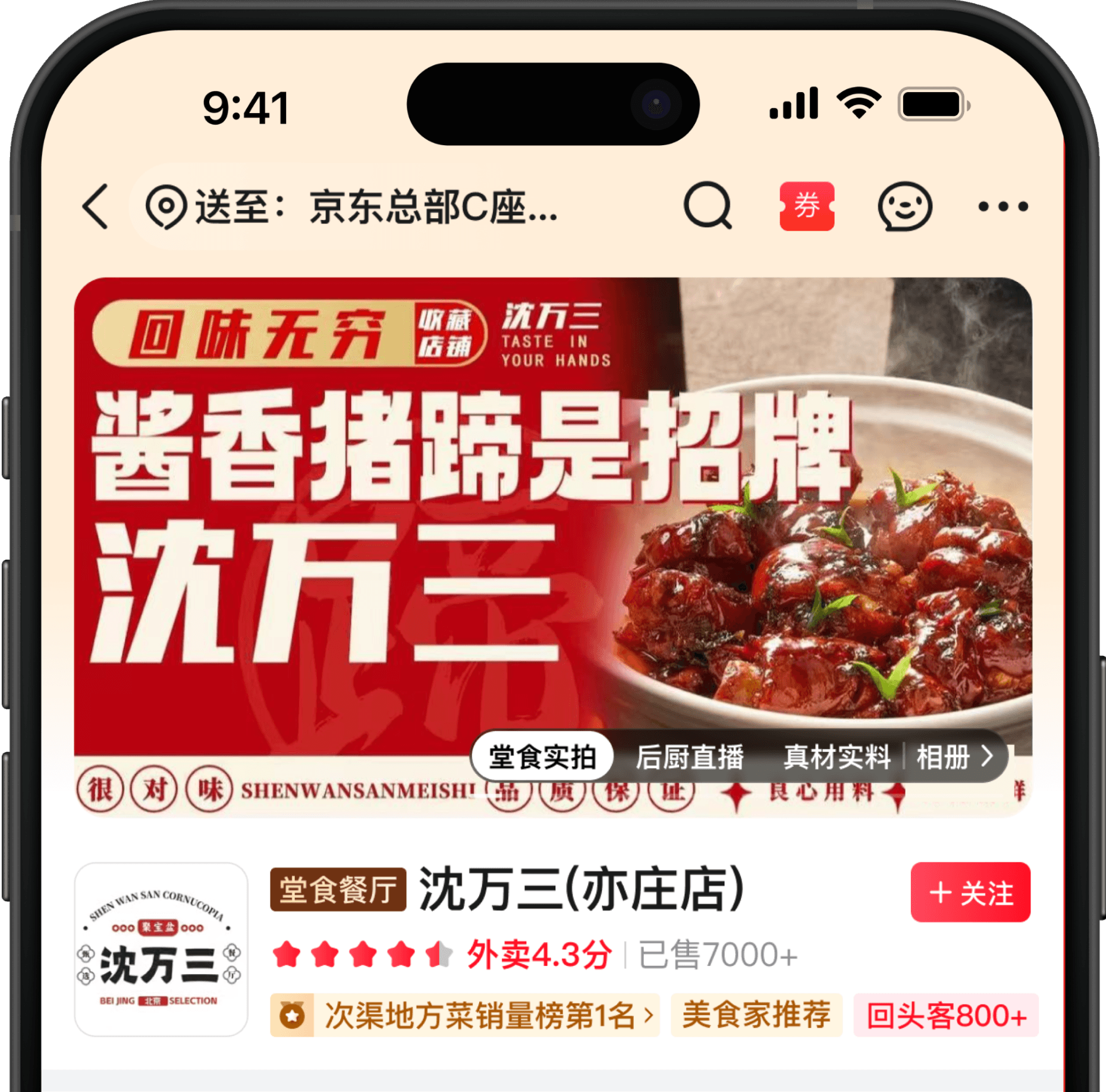
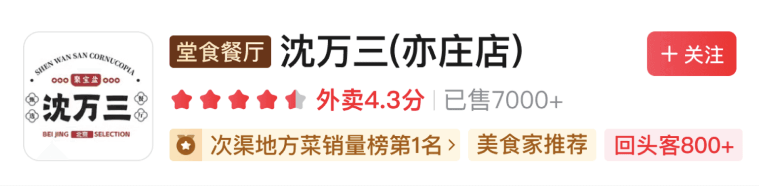
Key signals within 3 seconds
Rating
Sales
User recognition (social proof)
Help users build trust
BEFORE
AFTER
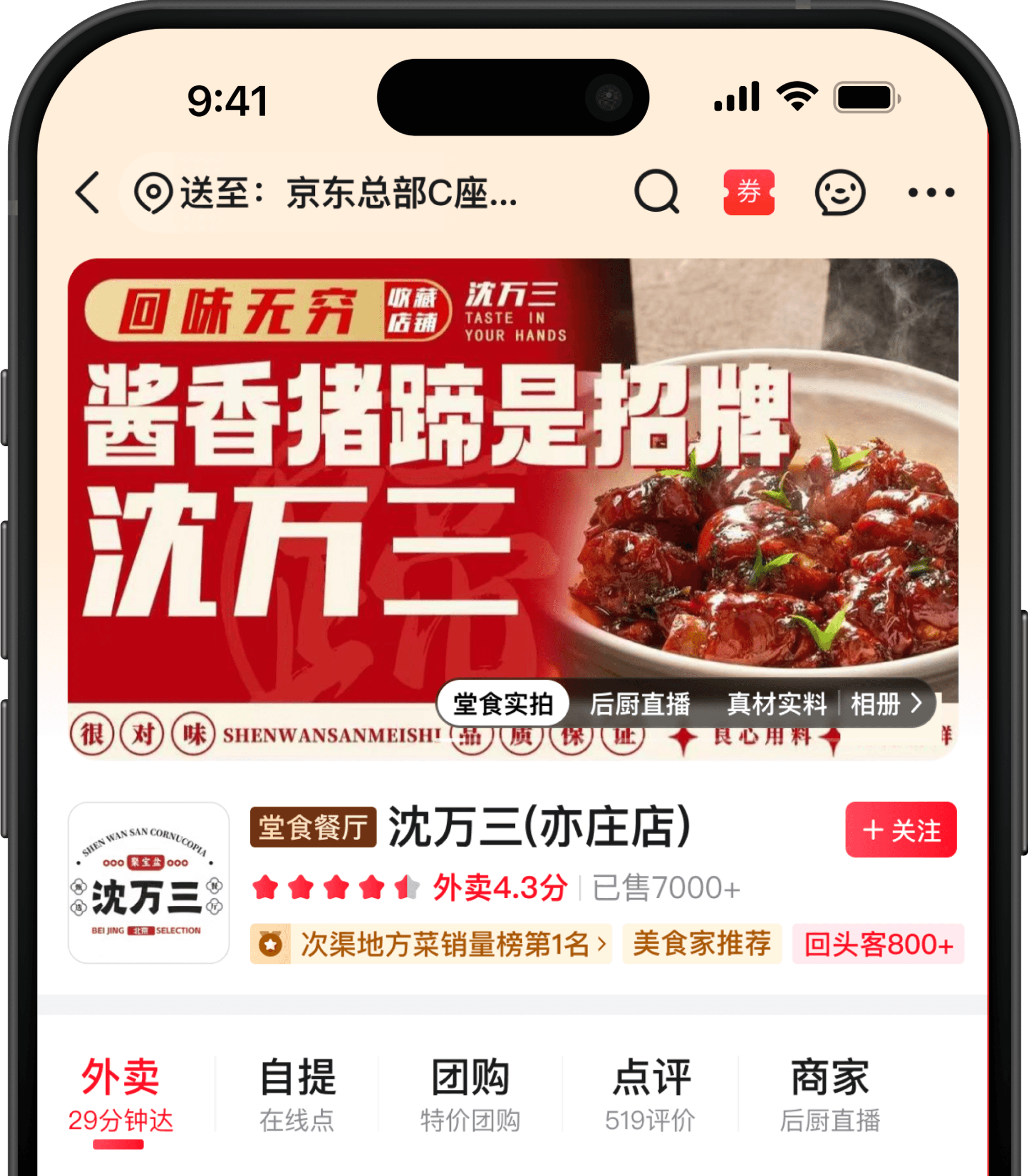


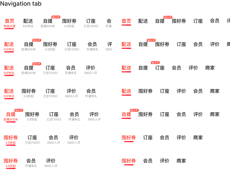
Comprehensive transaction hub
The goal is no longer simply to “complete a food delivery order,” but to turn the store into a comprehensive transaction hub.
AFTER
BEFORE
AFTER
AFTER
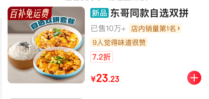
The discount > Subsidy amount
Social proof design.
Best Seller in the Store
100K+ sold
9 people think it tastes great
It helps reduce decision anxiety and increases purchase confidence.
02 · FRESH MARKET SCENARIO
BEFORE
AFTER
AFTER
BEFORE
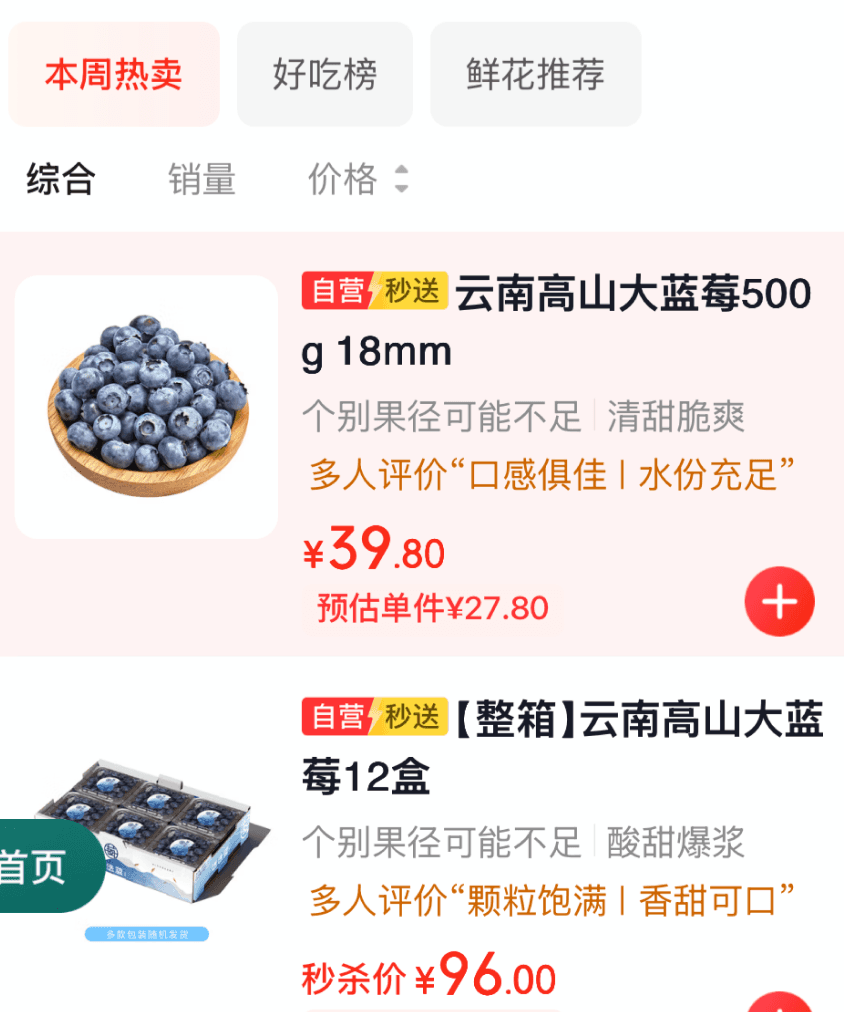
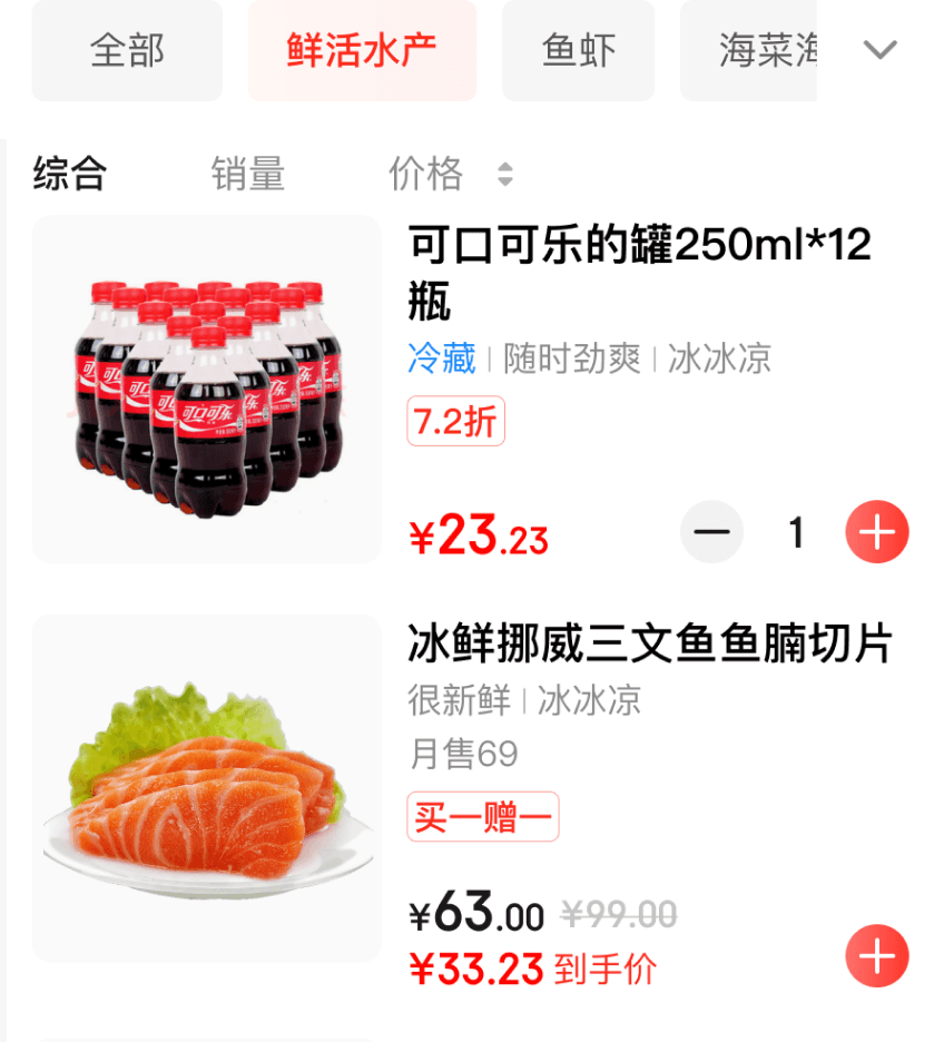
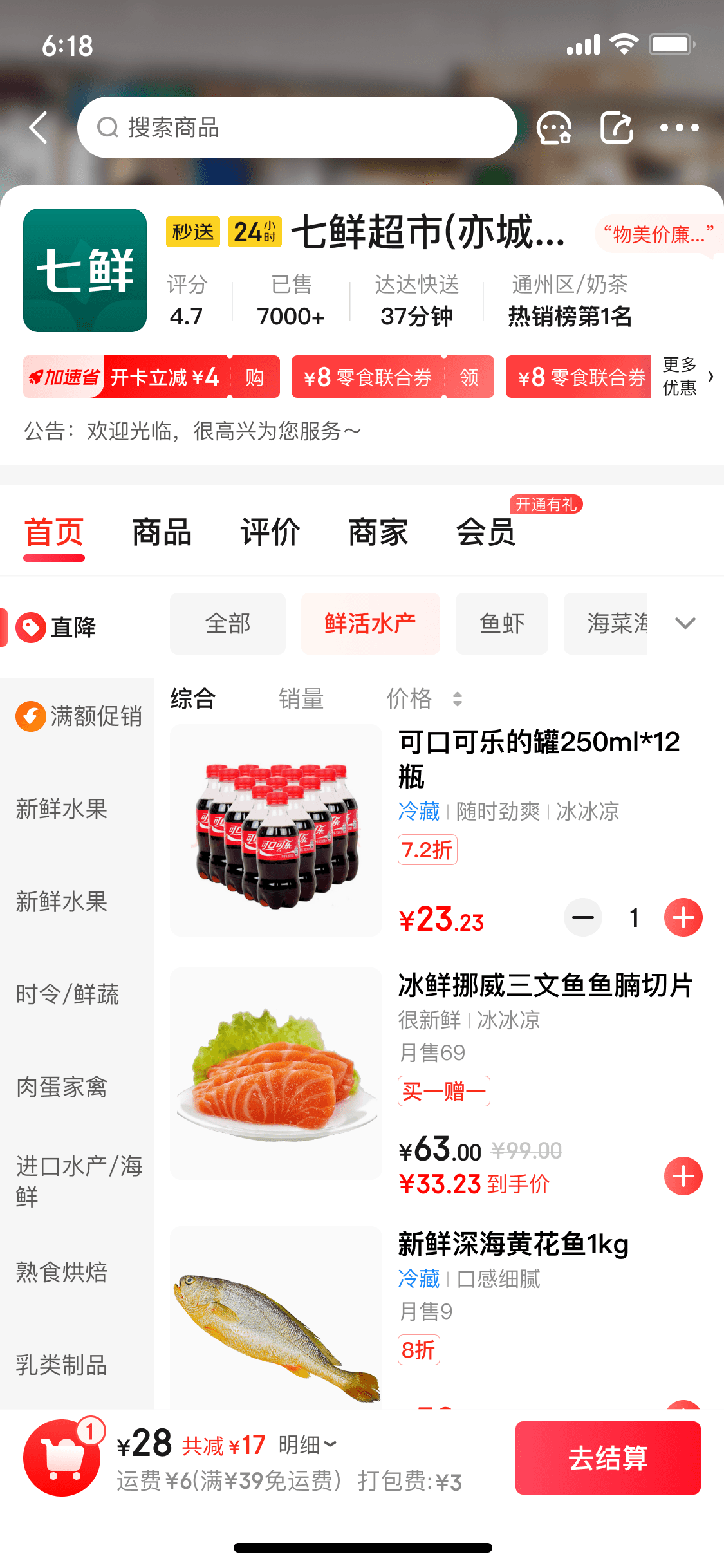
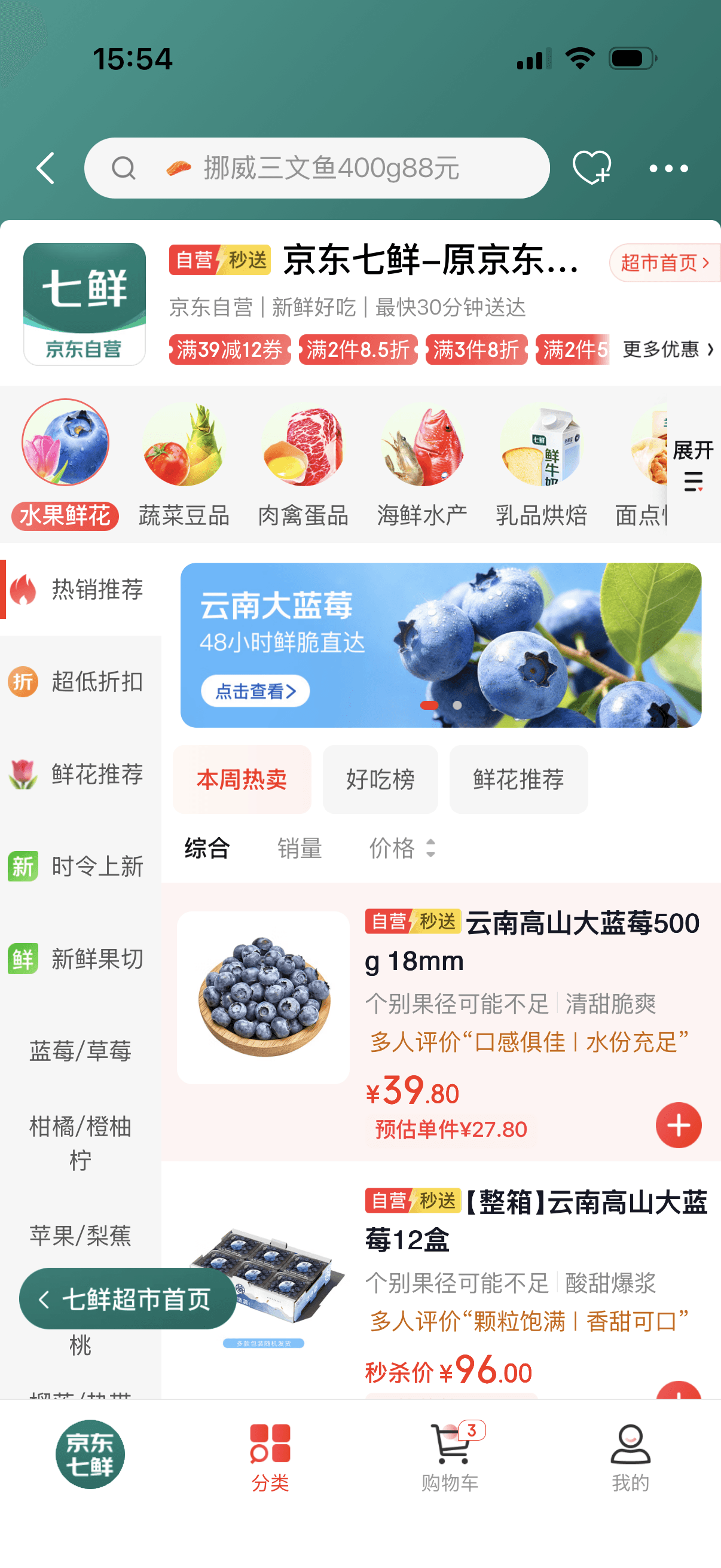
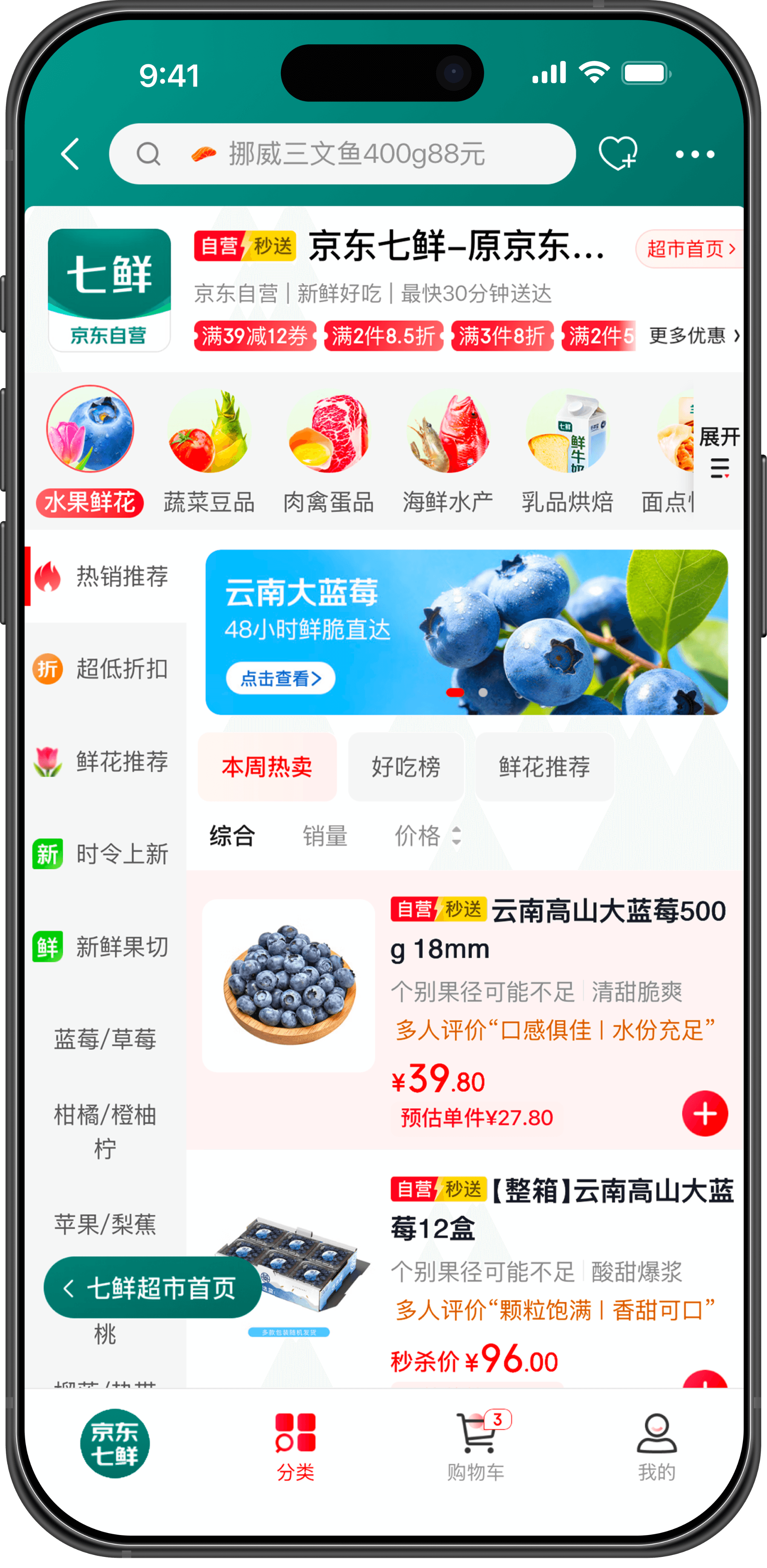
More compelling reasons for product decisions
Crisp and refreshing
Delicious texture
Juicy and succulent
Bursting with sweet and tangy flavor
Sweet and delicious
We’ve added taste descriptions and user reviews to the product cards, such as:
Reviews and sensory descriptions are more effective
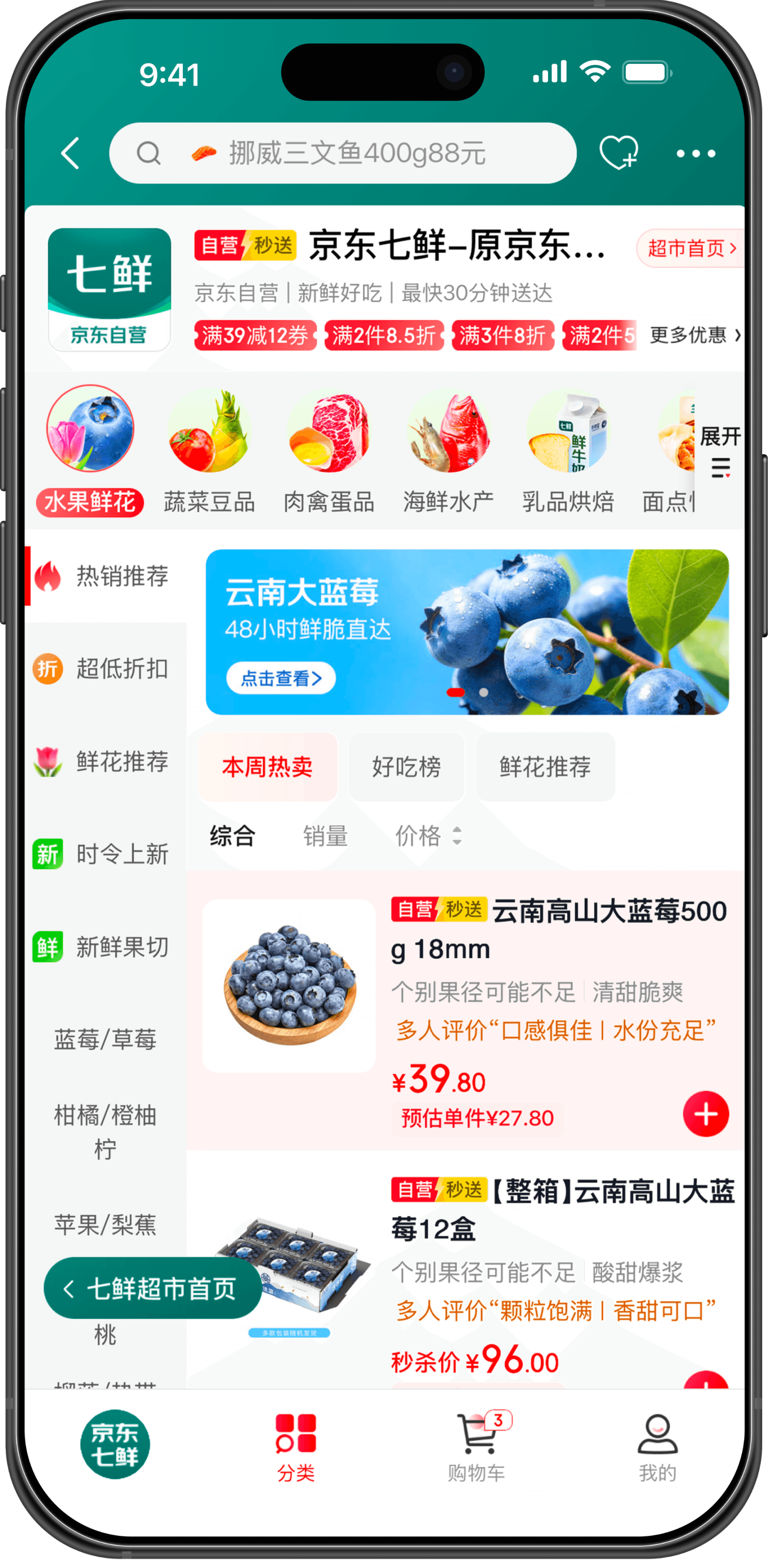
Better suited for browsing when users don’t have a specific goal in mind:
Browse Best Sellers
Browse Discounts
Browse Seasonal Items
Browse Recommendations
Browse New Arrivals
Browse Fruit Platters
We’ve added taste descriptions and user reviews to the product cards, such as:
This will increase user engagement and make it easier to drive impulse purchases.
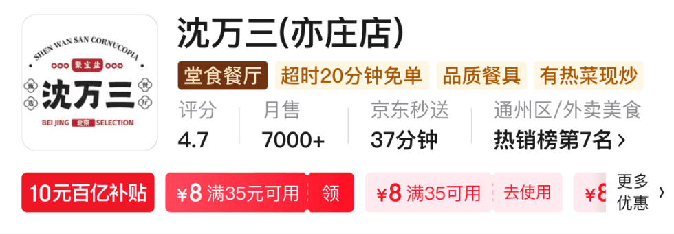
03 · Brand Store SCENARIO
BEFORE
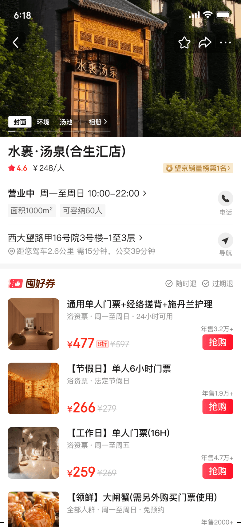
AFTER

More expressive ratings
4.7 stars
“Elegant atmosphere”
Over 7,000 monthly sales
Value:
Review Tags (Elegant Ambiance)
Popularity (Over 7,000 monthly sales)
In this way, ratings have evolved from mere “numbers” into “trust signals with explanations.”
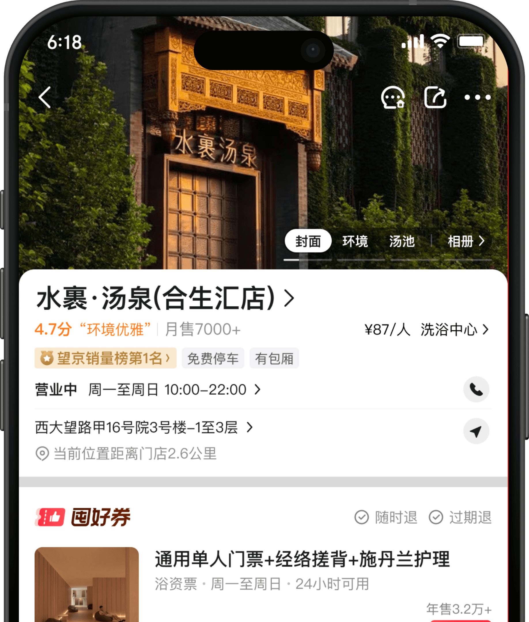
Price transparency facilitates better decision-making
Linking “price” and “business format” makes it easier for users to understand
“Per person” is not a standalone price point, but rather a benchmark for a restaurant's positioning.
Clearer selling points for the store
Free parking
Private rooms available
Value:
Shifting from “merchant-centric language” to “user-centric language”
REFLECTION · 05 · DESIGN IN INSTANT RETAIL
Design is not decoration.
It's a decision tool.
AN INNER QUESTION
05.A
In this project, I never sketched a single wireframe for decoration. What I actually did
was map cognitive tasks, analyze decision models, and build a structural system
that matches how different users think.
Looking back, I realized: I wasn't reorganizing information — I was designing the
architecture of a decision. The store page is not a canvas. It is a tool that helps
millions of people resolve uncertainty fast.
A NEW DEFINITION · 05.B
In instant retail, every second of hesitation
is a second closer to bounce.
Design's job is to eliminate hesitation. The deepest lesson from the store page project: design quality is not measured by how the
page looks, but by how quickly and confidently a user can decide.
01
Transparency
Clear pricing and discount logic eliminate
price-related hesitation before it forms.
02
Speed Signal
Visualized delivery time removes the
uncertainty that causes users to hesitate or
abandon.
03
Context Match
Adaptive structure aligned to each store type
meets users where their mental model
already is.